An inner look at the graphic design enthusiast’s haven
(Somerville Wire) – Tucked away on the Cambridge Line, you may happen upon the Katherine Small Gallery. It’s true to the suggestion of its name—the intimate space once held “standing-room only lectures,” packing as many people as possible into a room, on their feet, too close for seating. Opened by Michael Russem in the spring of 2018, the gallery is a whimsical exploration in detail, showcasing artifacts of graphic design, such as postage stamps and rare books and magazines. On Fridays and Saturdays, the little door on Beacon Street is open.
What inspired you to open the Katherine Small Gallery?
I think I mostly wanted to share my collections of graphic design with designers, and I hoped that non-designers (by which I mean normal people) could be introduced to the idea that graphic design is part of our everyday lives and that often these things have stories.
How does the gallery function as a space to “[look] closely at things that are usually overlooked”?
Well, if one puts a lot of space around something and then puts that thing behind glass, it instantly elevates it, because that’s how we treat things of importance, whether it’s a painting in a museum or a family photo or a Red Sox jersey. So, by presenting, say, a candy wrapper or a ticket or a book or some packaging for Barbie in that setting, our training as humans forces us to take a moment to stop and look. Now, if that candy wrapper is put next to a ticket which is next to a paperback book which is next to Barbie packaging, and all of that is behind glass, one might take a moment to figure out what these things have in common. Or what they don’t have in common.
The Katherine Small Gallery focuses on works relating to graphic design, typography, and printed ephemera. What drew you to this subject material, and what do you think is unique about it?
I’m a book designer, so my daily concerns are graphic design, typography, and printed ephemera. Once it could be said that the two most important industries were farming (because we need to eat) and printing (for the storage and communication of ideas). I don’t know if printing is still as important as farming, but as one who struggles to communicate clearly, the visual aspects of communication—of sharing ideas—are of interest to me.
How have you weathered the pandemic? Did you have to close for a time, and what are things like now?
Before the pandemic I would tell people they never had to buy anything when they came for a visit, that this place doesn’t do anyone any good if I’m just sitting here by myself. And during the shutdown I had the opportunity to test that theory. I think I closed in March through June or July of 2020. It was sad and lonely, but people should not have been risking their lives to visit my silly space. So, I had to start putting lots of books for sale online—which was antithetical to the whole premise of the place. I’d wanted for people to see and experience things in real life. Visits are increasing, but it is very much like when I first opened in 2018 and business was terribly slow. In the scheme of things, however, I have absolutely nothing to complain about.
What are some parts of your collection or pieces on display that stand out to you? Would you be able to describe some of your favorite works at the gallery?
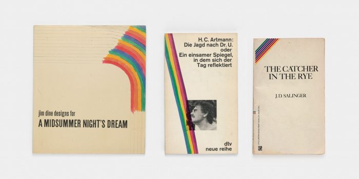
The present show is about things that have nothing to do with one another until they are put side-by-side behind glass. My favorite grouping consists of three book covers, made over twenty years apart, but they share graphic elements. The exhibition label reads, “While it would require an incredibly long time for an infinite number of monkeys with an infinite number of typewriters to, by chance, type out the complete works of Shakespeare, giving paper and a set of markers to an artist (Jim Dine), graphic designer (Celestino Piatti), and author (J.D. Salinger) seems to more easily result in incomplete rainbows on the edges of book covers.”
I understand that you also design books. How do you approach book design as an art form, and how does an attention to detail inform your work? How do you convey the character of a book through its design?
I would argue that book design is a craft, not an art. My own interests and ideas are secondary (or tertiary [or irrelevant]) to those of the author. So, what I do is a service, not an expression. But there are tons of small, invisible decisions that can convey the character of content. The most obvious decision is related to the choice of typeface. People are often surprised to learn that there are more than a few typefaces and that they each have some sort of historical baggage. But imagine the lettering that we all recognize as belonging to the Red Sox. Now imagine using that same lettering to type out “Yankees.” Even if one didn’t care about baseball, chances are that person would recognize something was wrong. The role of a book designer is to either give tiny clues about the content or to remain neutral and stay out of the content’s way. Knowing when to take either approach is the real trick. And the gallery is meant to draw attention to that trick by giving people an opportunity to slow down and look.
Katherine Small Gallery
108 Beacon Street
Somerville, MA 02143
617-576-0584
All Somerville Wire articles may be republished by community news outlets free of charge with permission and by larger commercial news outlets for a fee. Republication requests and all other inquiries should be directed to somervillewire@binjonline.org.
SUBSCRIBE TO THE FREE SOMERVILLE WIRE EMAIL NEWSLETTER: https://eepurl.com/hpBYPv
Shira Laucharoen is assistant director of the Boston Institute for Nonprofit Journalism and assistant editor and staff reporter of the Somerville Wire.


